~ / teaching / InfoVis / practical works / ScatterPlot
© 2023—2024 - Renaud Blanch
The goal of this practical work is to build a first visualisation using D3.js with data having more than 2 attributes, using the position, size, color and shape visual variables.
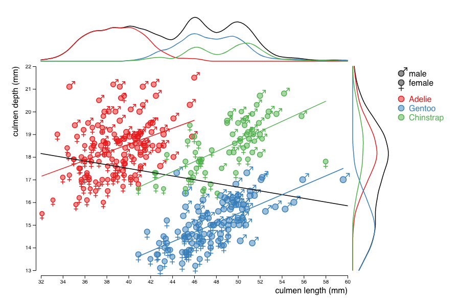
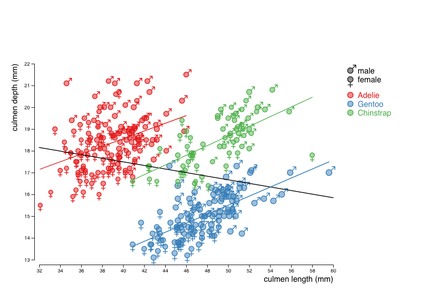
You will reproduce the visualization below that show the relationship between the beack length and width for different species of penguins. This visualisation shows an example of the so-called Simpson's paradox: the correlation between length and width is negative when looking at the whole population, but positive for each of the sub-populations.
Get the archive that contains the dataset; the version of D3.js that you are going to use; and a visualisation template. Unzip it and get used to its content.
The data directory contains the dataset: a list of penguins observed at the Palmer Station (sources: [1, 2, 3]).
The (comma-separated) columns give (among other attributes) some key characteristics of each penguin observed: its species, its beack length and width (culmen_length, culment_depth), its flipper length (flipper_length), its mass, and its sex.
The vendor directory contains the D3.js version 7.8.5 code.
The viz directory contains a visualisation template that produces an HTML table of the penguins, with all their attributes given.
To test this template, you need to start a web server. The simplest way to go is using python in a terminal as shown below:
% tar xzvf penguins.tgz
x penguins/data/
x penguins/data/table_219.csv
x penguins/data/table_220.csv
x penguins/data/table_221.csv
x penguins/vendor
[...]
x penguins/viz/
x penguins/viz/penguins.html
% cd penguins/
% python3 -m http.server
Serving HTTP on 0.0.0.0 port 8000 ...
You can then open in a new tab your local version of the visualisation that should display the penguins list, as the online version does.
First, build a ScatterPlot showing culmen length (culmen_length) as a function of its depth (culmen_depth) for each penguin displayed as a circle.
culmen_length and the culmen_depth (see this tutorial).culmen_length and culmen_depth using two linear scales, and then add a circle (radius 5, stroke width .5 and fill opacity .5) to each of those groups.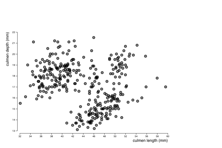
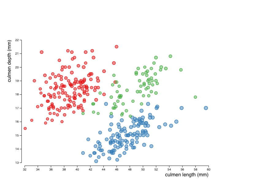
Next, use the size of the circles to encode the mass of the penguins and colors to encode their species.
species is nominal, we should use an ordinal scale that is designed to map discrete attributes to discrete visual variables.
The range of colors can be chosen using a predefined one provided by D3:
const color = d3.scaleOrdinal(d3.schemeSet1);
let species = new Set(data.map(d => d.species));
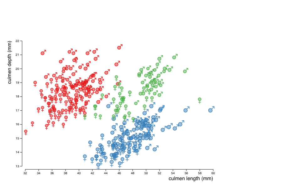
Last, give each penguin a shape that depends on its sex.
To do so, you will again use a scale, this time mapping a nominal attribute (the sex) to the shape visual variable.
Again, an ordinal scale is appropriate.
You can again set its domain from the dataset:
let sexes = new Set(data.map(d => d.sex));
The range of the scale should consist in shapes.
The d3-shape module provides support for symbols, a set of predefined shapes.
See this example of a way to use symbols with ordinal scales to understand how to set the range of the scale with symbols.
Use two symbols suitable for stroking, e.g. d3.symbolCircle and d3.symbolSquare2.
The size parameters of symbols sets their area, so the scale used for the mass should now be linear (and no longer a square root scale as above).
In the picture below, we use the male and female signs (♂ and ♀) as symbols. To do so we need to define custom symbols. The following code is a way to do so:
var customFemale = {
    draw: function(context, size) {
        size = Math.sqrt(size/Math.PI);
        const s2 = Math.sqrt(2);
        context.arc(0, 0, size, 0, Math.PI * 2);
        context.moveTo(0, size);
        context.lineTo(0, s2*2*size);
        context.moveTo(-(s2-1)*2*size, 2*size);
        context.lineTo((s2-1)*2*size, 2*size);
    }
}
var customMale = {
    draw: function(context, size) {
        size = Math.sqrt(size/Math.PI);
        const s2 = Math.sqrt(2);
        context.arc(0, 0, size, 0, Math.PI * 2);
        context.moveTo(s2*size/2, -s2*size/2);
        context.lineTo(2*size, -2*size);
        context.moveTo(2*size, -2*size);
        context.lineTo(size, -2*size);
        context.moveTo(2*size, -2*size);
        context.lineTo(2*size, -size);
    }
}
var shape = d3.scaleOrdinal()
    .range([customMale, customFemale]);
Add a legend to the graph.
To build the legends, you can consider them as visualisations of small datasets.
Those datasets are exactly those built to set the domains of the ordinals scales: the species and sexes sets.
You can apply the same scales as the ones constructed for the main visualisation to transform those values onto graphical elements suitable to build the legend.
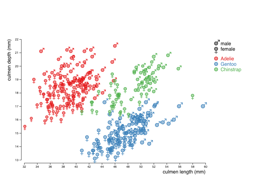
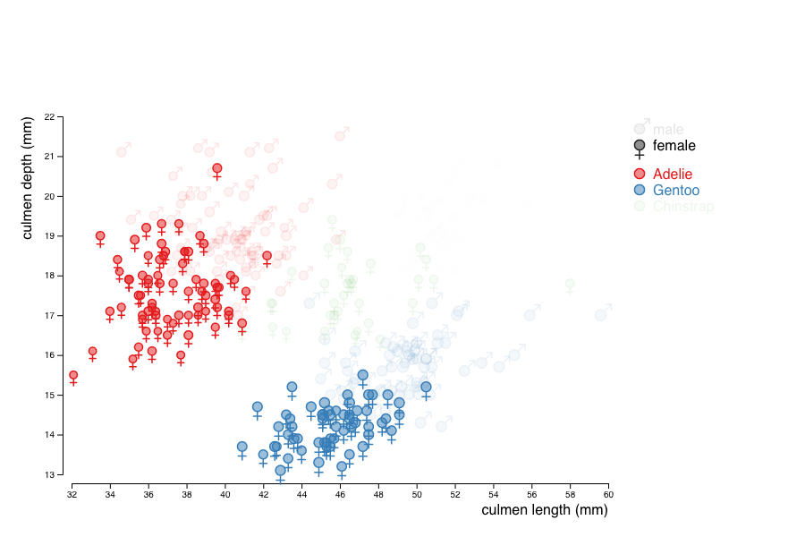
Make the legend clickable, so that values can be filtered.
The easiest way to achieve this is to add the sex and the species to the class attribute of the marks produced for each penguin.
You can then add event handlers to the elements of the legend so they can react to mouse clicks and use the selection mechanism to find the marks to hide or show by setting their opacity to .1 or 1 according to their class.
In order to highlight the Simpson's paradox, add regression lines to the whole population and to each species considered.
To compute the linear regression, you can use the function linear_fit provided in the Anscombe's quartet practical work.
This function returns a linear fit of the data for the two attributes passed as parameters.
You can then apply this function to the extent of the domains of the culmen_length for the different subsets of penguins considered to get something like that:
Finally, use kernel density estimation (KDE) to show the 1D distributions of the culmen dimensions, for the whole dataset and the 3 species. To compute the KDE, you can get inspiration from this d3 KDE example by Mike Bostock. Your final visualisation may then look like this:

last update: oct. 7, 2024